ツボエ|名刺・ブランドカード
Project Info
- Client:
- 株式会社ツボエ
- Year:
- 2024
Client:
株式会社ツボエ
Year:
2024
Credits
- Art Director:
-
- 栗山 薫(kuriyama kaoru design)
- Graphic Designer:
-
- 栗山 薫(kuriyama kaoru design)
Art Director:
栗山 薫(kuriyama kaoru design)
Graphic Designer:
栗山 薫(kuriyama kaoru design)
Categories
Overview
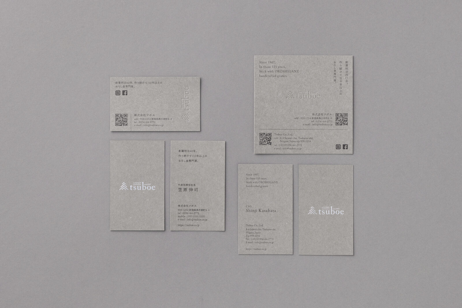
明治40年創業の老舗金物メーカー、株式会社ツボエの名刺およびブランドカードを制作しました。
企業のコーポレートアイデンティティを体現するツールとして、国内向けと海外向けの2種を設計。伝統と職人技を受け継ぐ企業姿勢と、グローバルに通用する洗練性を両立させています。
用紙には、ツボエのキラーブランドであり主力製品でもある「極上おろし金」のパッケージに使用したものを採用。ブランドの象徴となる素材を名刺にも使用することで、視覚だけでなく触覚でも一貫性のあるブランド体験を設計しました。
ロゴは空押しやマットシルバー箔で表現し、重厚なグレーの紙質とあいまって、静かな存在感と上質感を演出。
語版にも「OROSHIGANE(おろし金)」の伝統を語るコピーを添え、国境を越えてブランドの精神が伝わるよう配慮しています。
Tsuboe|Business Cards & Brand Cards (Domestic / Global Versions)
We designed business cards and brand cards for Tsuboe Co., Ltd., a long-established metalware manufacturer founded in 1907.
Serving as tools to embody the company’s corporate identity, two distinct versions—domestic and international—were created. The design balances a legacy of craftsmanship with a refined aesthetic suited for global communication.
The paper stock used is the same as that featured in the packaging of Gokujou Oroshigane, Tsuboe’s flagship product and best-selling grater. By incorporating this iconic material into the cards, we crafted a brand experience that is consistent not only visually but also in tactile impression.
The logo is rendered using blind embossing and matte silver foil, producing a quiet yet dignified presence when paired with the textured grey paper. The English version includes a short phrase introducing the OROSHIGANE tradition, ensuring that the brand’s heritage resonates beyond borders.
All Works
Next Work