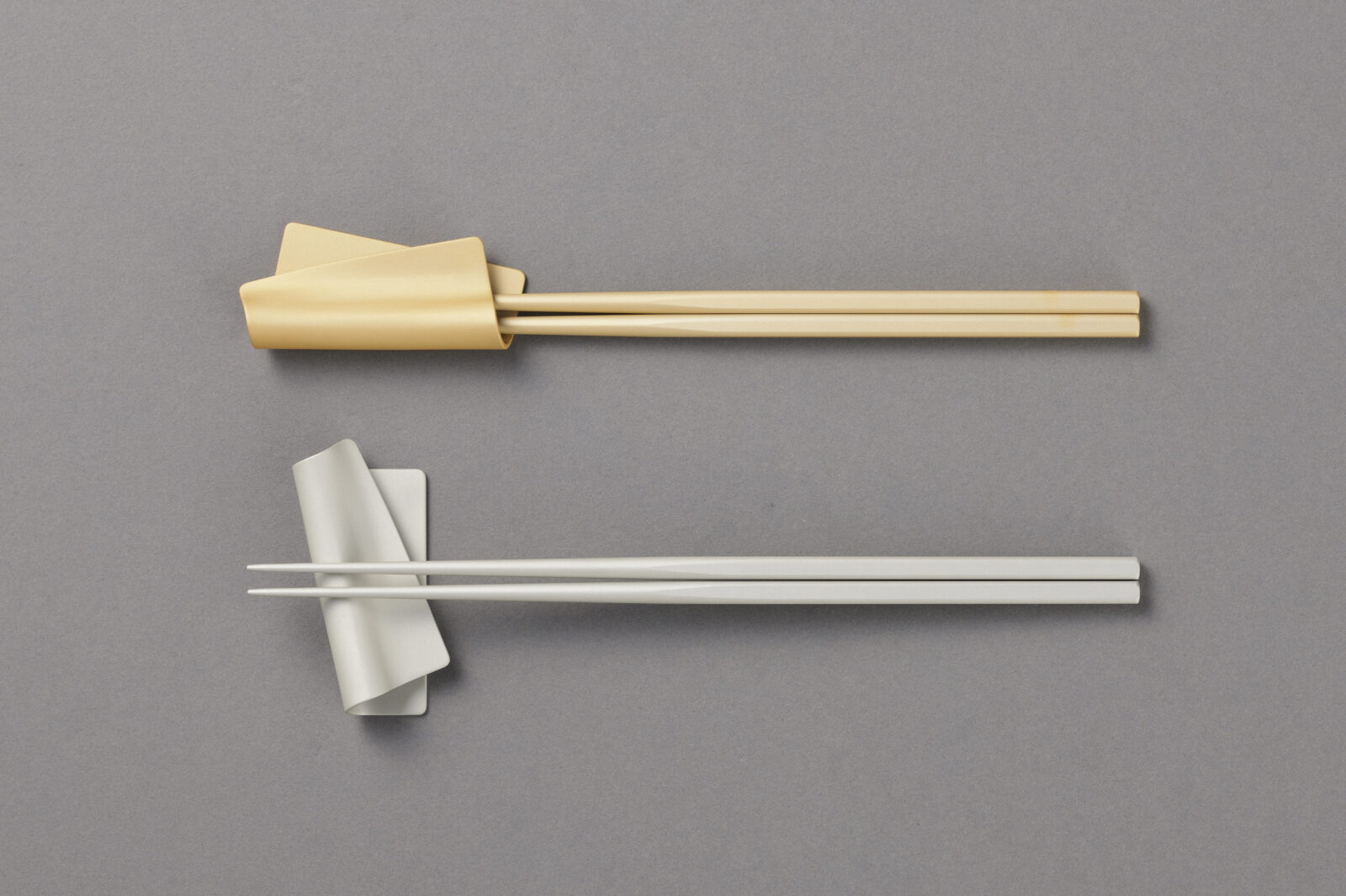
irogami chopstick rest|箸置き
Project Info
- Client:
- 株式会社ツボエ
- Year:
- 2025
Client:
株式会社ツボエ
Year:
2025
Credits
- Art Director:
-
- 栗山 薫
- Package Designer:
-
- 栗山 薫
- Illustrator:
-
- 嶋田 雅紀
- Translators:
-
- 船木 亜瑠(Aru International)/ 澤田 友紀(Aquascorpio)
- Product Designer:
-
- Gensuke Kishi
Art Director:
栗山 薫
Package Designer:
栗山 薫
Illustrator:
嶋田 雅紀
Translators:
船木 亜瑠(Aru International)/ 澤田 友紀(Aquascorpio)
Product Designer:
Gensuke Kishi
Categories
Overview
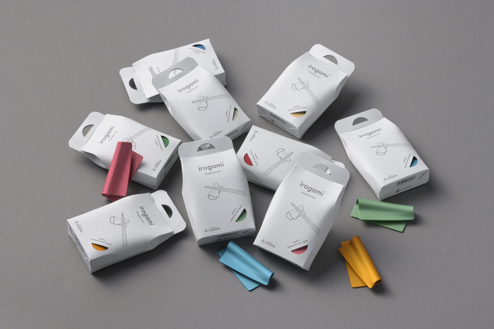
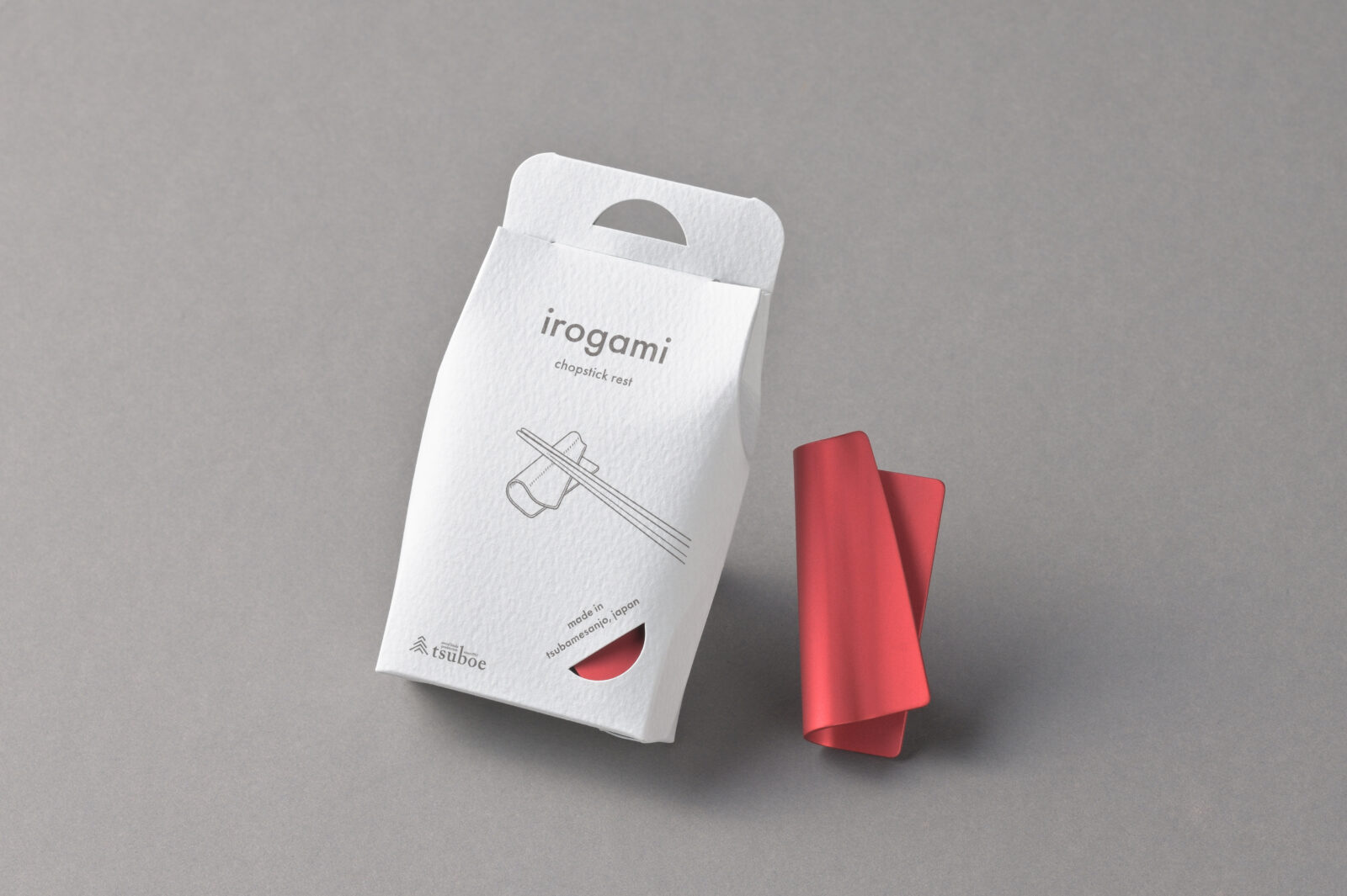
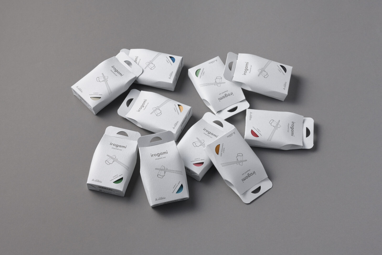
創業明治40年の老舗・株式会社ツボエが展開するブランド「irogami」のおろし金パッケージのアートディレクションとパッケージデザインを担当しました。
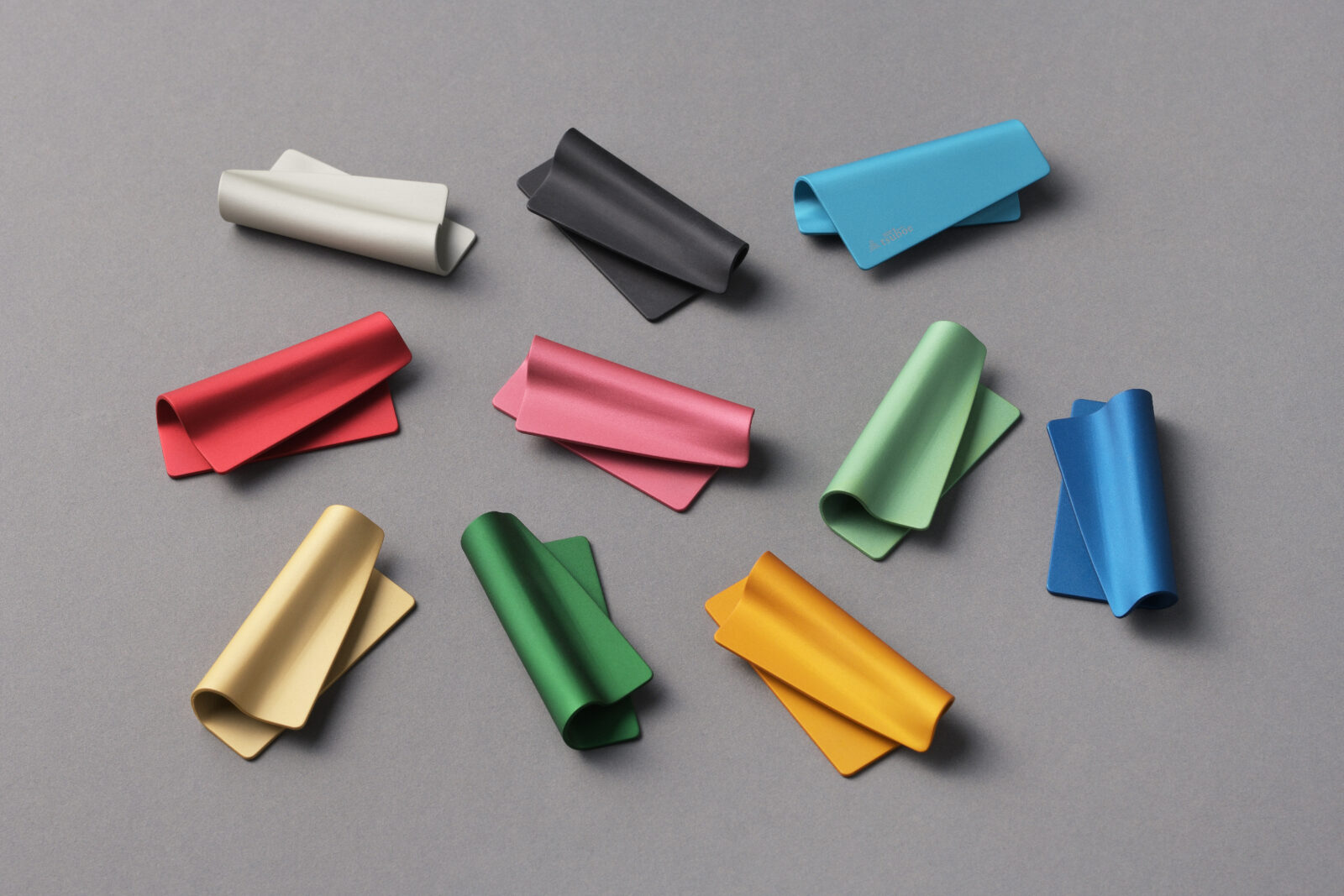
ブランドコンセプトである「紙をめくったようなしなやかな曲線」を反映し、カラーアルマイト加工のジグ用穴のかたちを「フック掛け」と「色確認窓」に採用。機能と美しさを両立し、コスト削減を実現。
既存の irogami grater と同じコンセプトを踏襲しつつ、小型サイズに合わせた細部の調整で高級感を損なわないよう配慮しました。
ツボエ製品全体の統一感を意識し、アイスグレーの用紙で鮮やかな製品を包むデザインに。落ち着いたトーンで高級感を演出し、ギフトにも最適な仕上がりに。
プラスチックを一切使用せず、機能性と環境への配慮を両立したデザインです。
We provided art direction and packaging design for irogami, a brand from Tsuboe—an established maker founded in 1907.
Guided by the concept of “graceful curves, like turning a sheet of paper,” we transformed the jig hole needed for color anodizing into both a hang-slot and a color-window, uniting function and beauty while keeping costs in check. Building on the language established with the original irogami grater, we scaled every detail to suit the new, smaller format—preserving a sense of luxury in spite of the size reduction.
To ensure harmony across the entire Tsuboe range, the vivid metal piece is wrapped in textured ice-grey paper. The subdued tone conveys quiet elegance and positions the product as an ideal gift.
The package is completely plastic-free, achieving a balance between functionality and environmental responsibility.
All Works
Next Work