ツボエのSHIRO
Project Info
- Client:
- 株式会社ツボエ
- Year:
- 2023
- Award:
-
- 日本パッケージデザイン大賞 ホームケア&電化製品・雑貨部門 入選
Client:
株式会社ツボエ
Year:
2023
Award:
日本パッケージデザイン大賞 ホームケア&電化製品・雑貨部門 入選
Credits
- Art Director:
-
- 栗山 薫(kuriyama kaoru design)
- Package Designer:
-
- 栗山 薫(kuriyama kaoru design)
Art Director:
栗山 薫(kuriyama kaoru design)
Package Designer:
栗山 薫(kuriyama kaoru design)
Categories
Overview
株式会社ツボエが展開するサブブランド、ツボエのSHIROパッケージの、アートディレクションとデザインを担当しました。
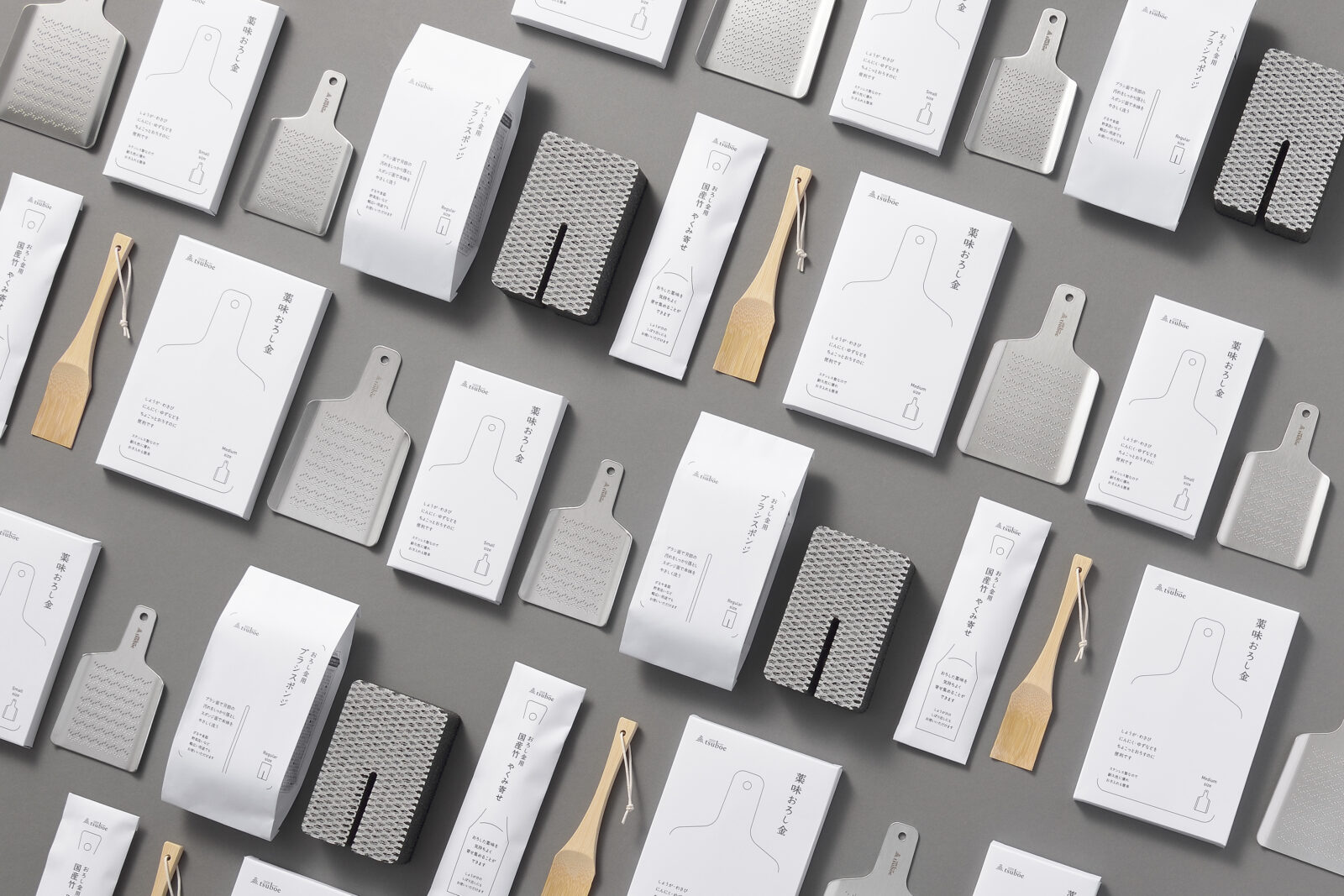
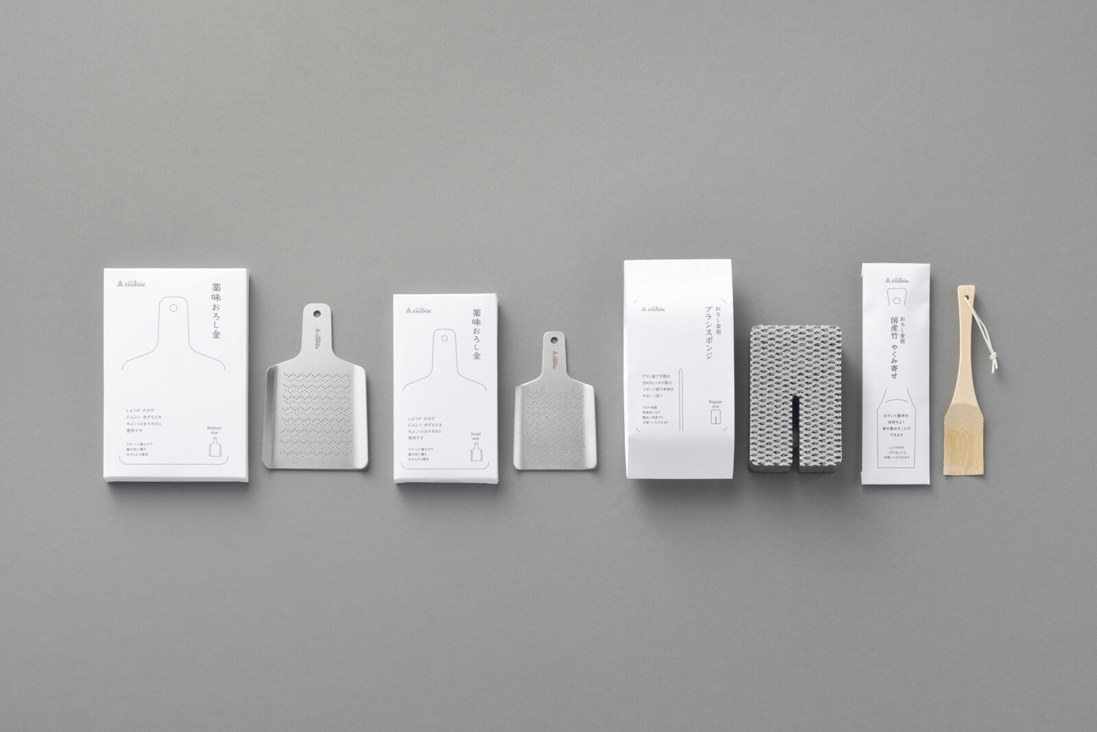
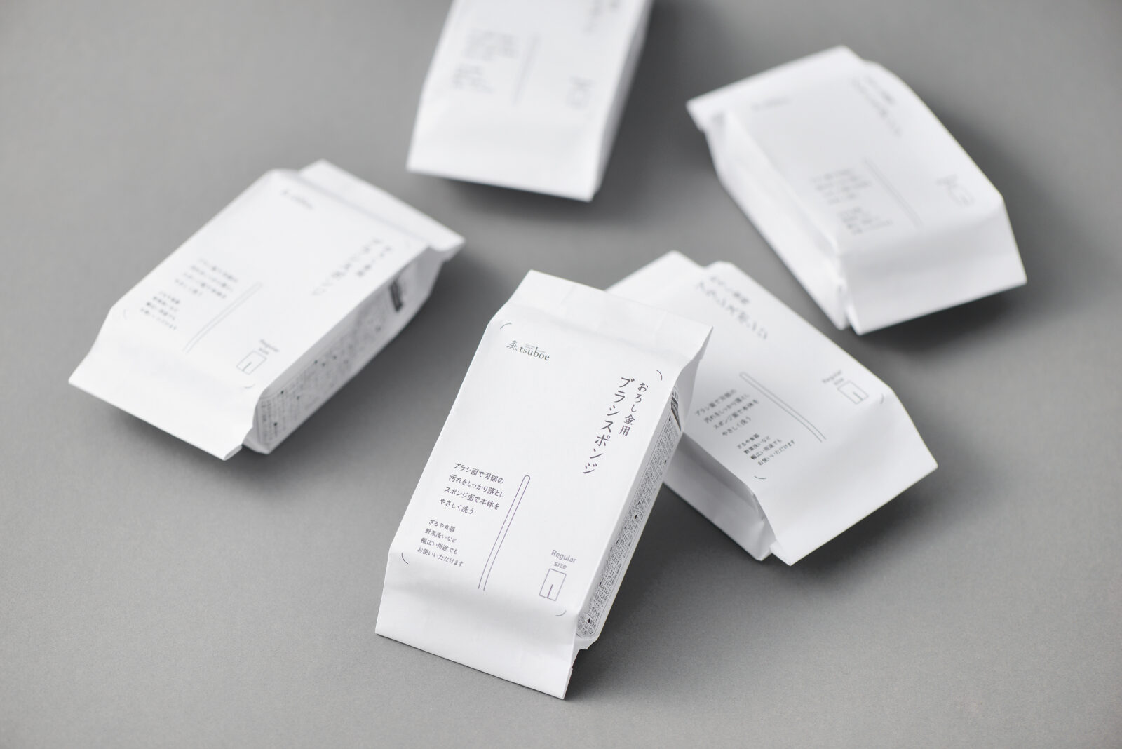
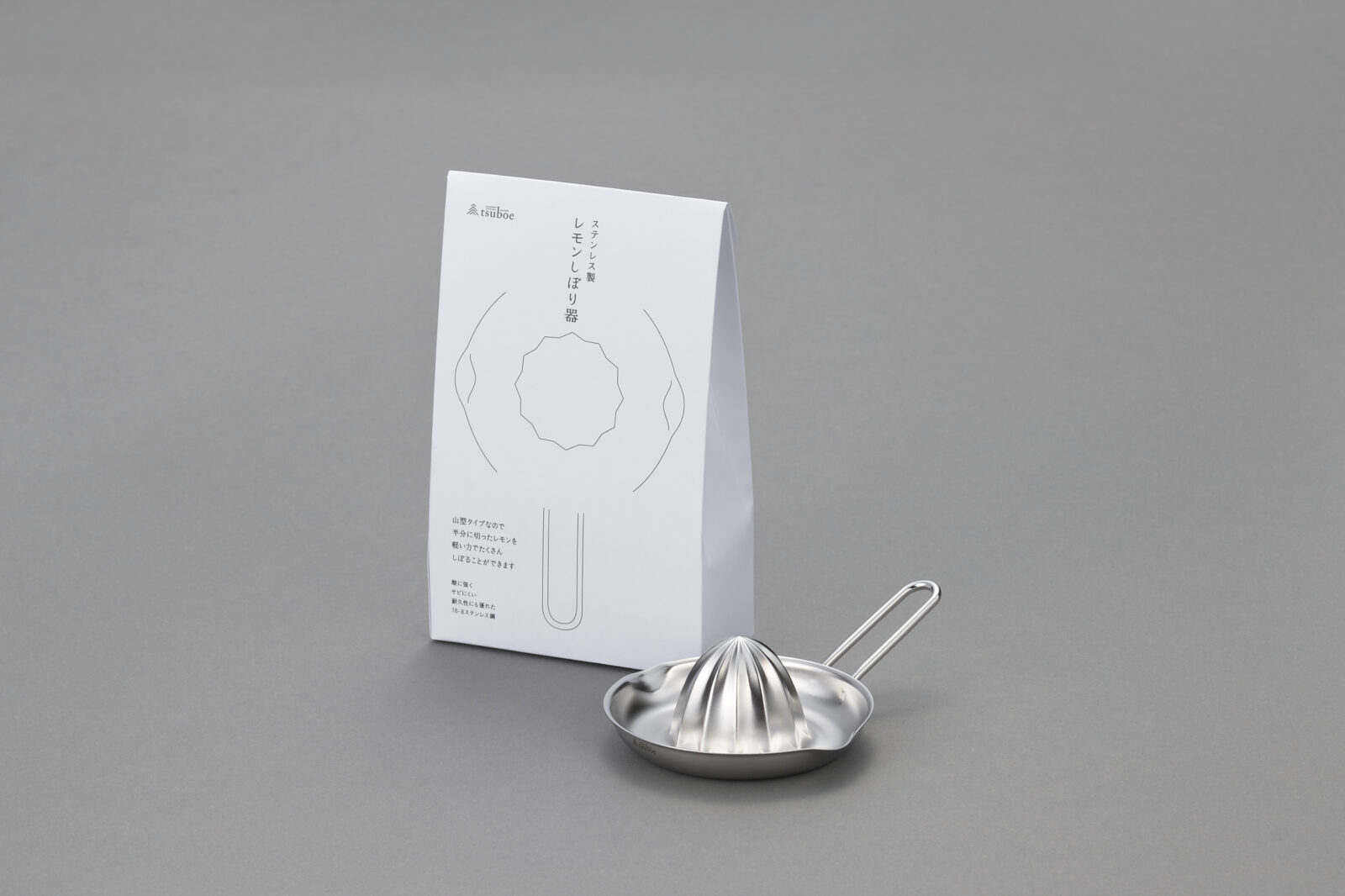
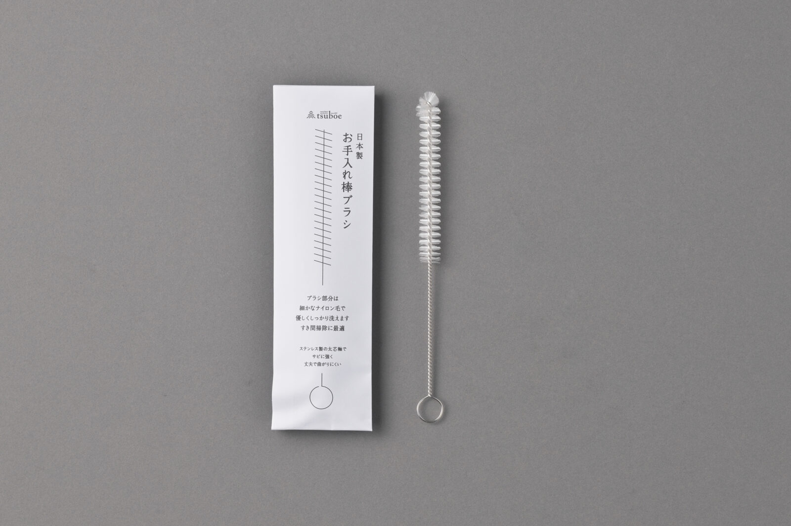
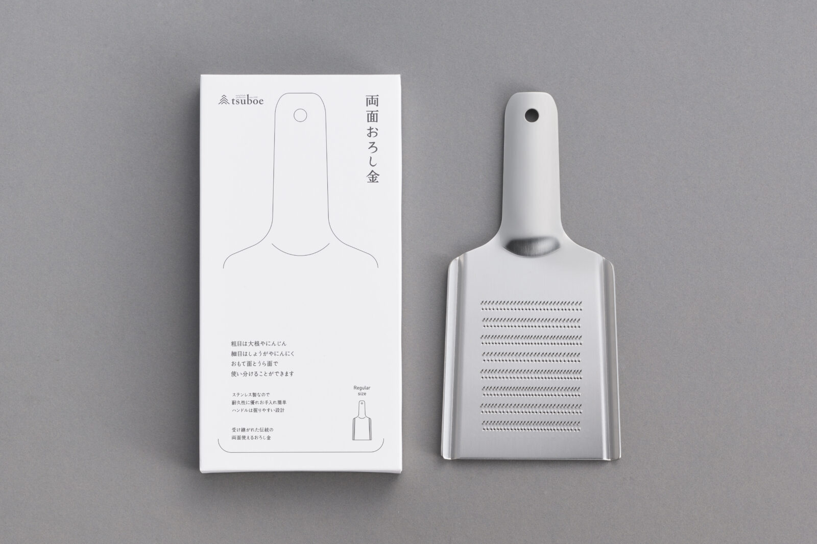
極上おろし金シリーズをより快適に楽しんでいただくために立ち上げられた本ブランドは、名前のとおり「何色にも属さない」純白をキーカラーに設定。外装をすべて高白色の紙素材に統一し、余計な装飾をそぎ落としたミニマルな世界観で高級感とブランド一貫性を高めました。
中身が見えない代わりに、製品シルエットをほぼ実寸でイラスト化し、用途を直感的に伝達。素朴な線画と余白を生かしたレイアウトが機能性と温かみを両立しています。
製品ごとにばらついていた外装仕様を共通構造に整理したことで、資材点数と保管スペースを削減しながら、売場でのまとまり感を向上させました。
プラスチック資材はゼロ。店頭陳列はもちろん、ギフト需要にも応える佇まいを実現しています。
We oversaw art direction and packaging design for tsuboe SHIRO, a sub-brand created to enhance the premium grater line.
True to its name—“belonging to no color”—SHIRO adopts pure white as its signature hue. Every outer surface is clad in high-whiteness paper, and all superfluous decoration is pared away to achieve a minimalist presence that elevates both luxury and brand cohesion.
Because the contents remain hidden, each product’s silhouette is rendered at near-actual size, delivering instant clarity. Simple line art set in ample white space balances warm approachability with functional precision. By consolidating previously varied package formats into a single structure, we cut material SKUs and storage requirements while presenting a tighter, more unified shelf display. With zero plastic components, the package satisfies retail needs and gift expectations alike.
All Works
Next Work