Traditional Products|パッケージ刷新プロジェクト
Project Info
- Client:
- 株式会社ツボエ
- Year:
- 2025
Client:
株式会社ツボエ
Year:
2025
Credits
- Art Director:
-
- 栗山 薫(kuriyama kaoru design)
- Package Designer:
-
- 栗山 薫(kuriyama kaoru design)
Art Director:
栗山 薫(kuriyama kaoru design)
Package Designer:
栗山 薫(kuriyama kaoru design)
Categories
Overview
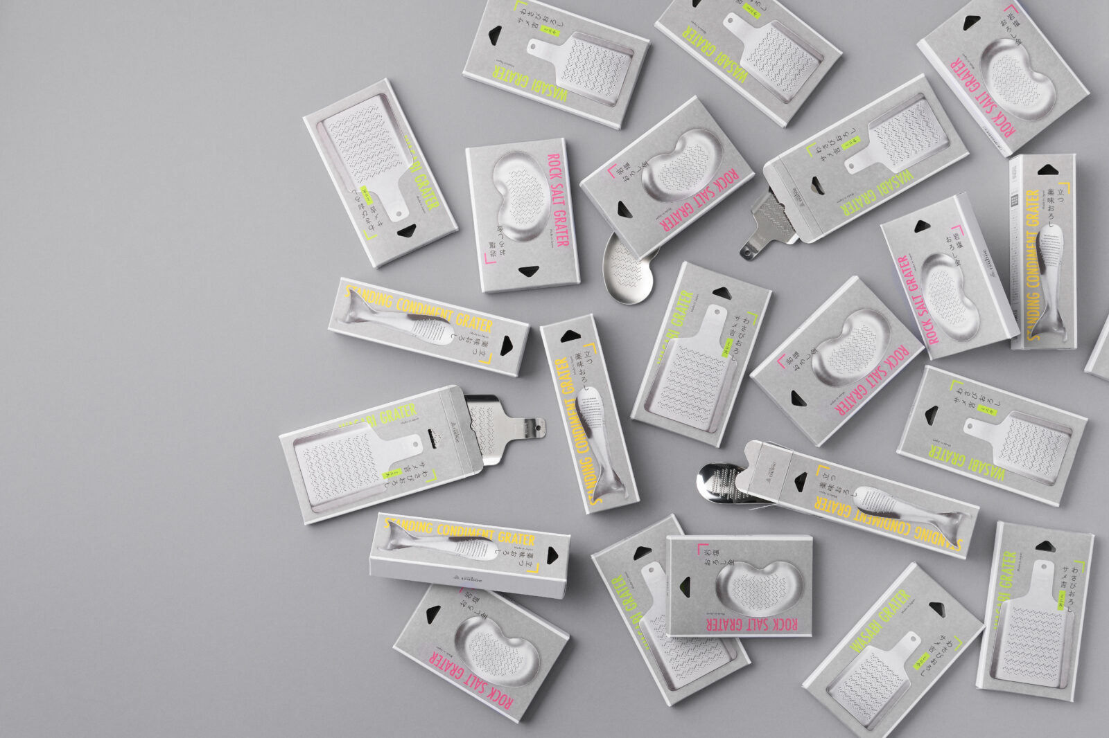
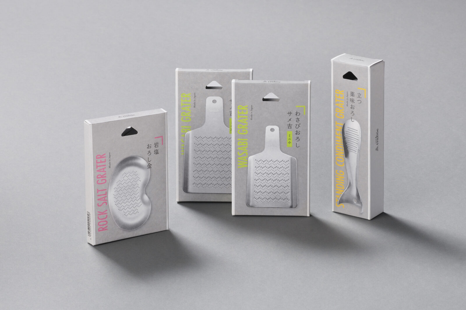
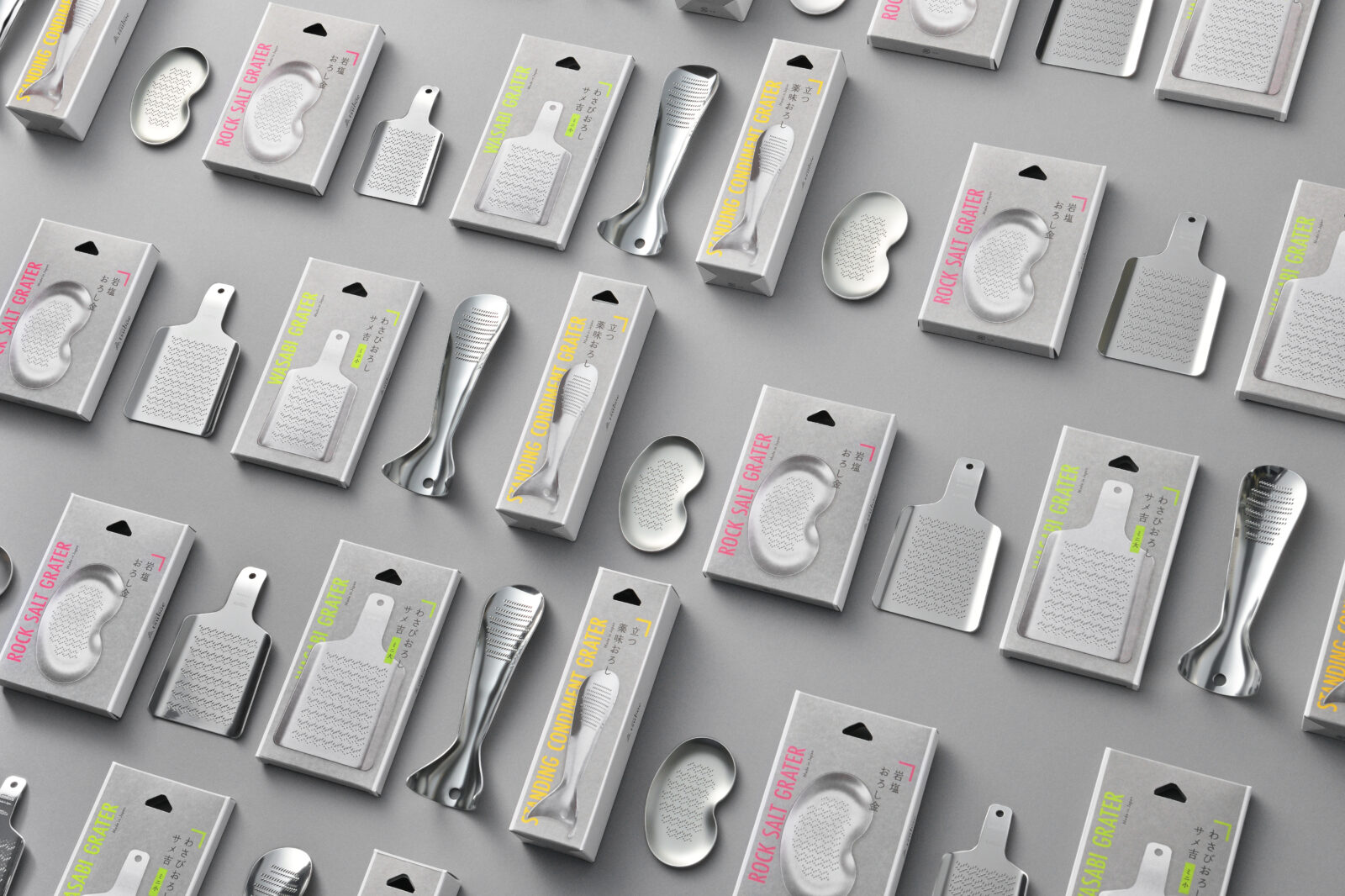
老舗おろし金メーカーが展開する「Traditional Products」シリーズのパッケージを、環境対応とブランディング強化の観点からリニューアルしました。
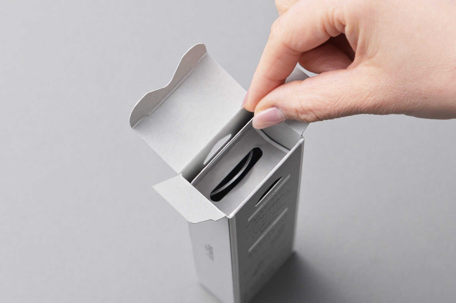
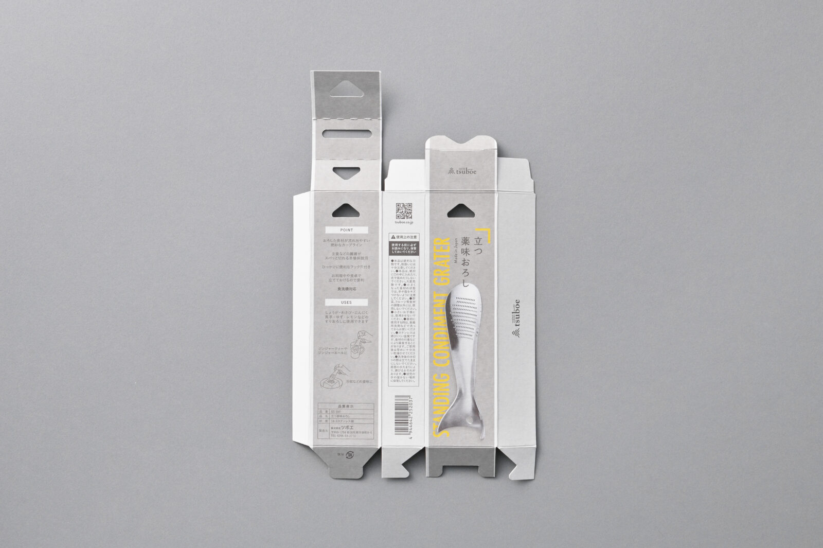
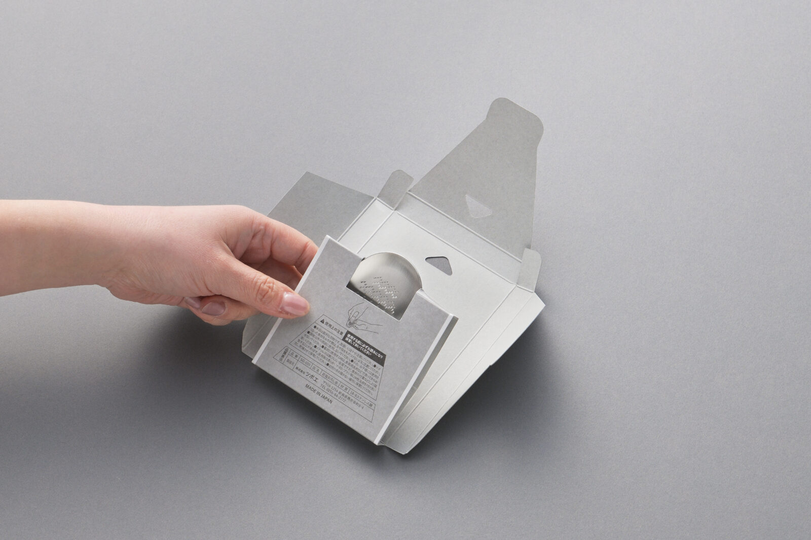
製品ごとに異なっていた外装を統一し、素材はすべて紙製に。インナーはフック機能を内包した一体型構造とし、高級感と組み立てやすさに配慮しました。
用紙はFSC®認証を取得した業務用紙「コラボファインG」を使用。印刷に適さない特性を逆手に取り、ムラを風合いとして活かすことで独特の質感とコスト削減を両立。
用途ごとのカラー設計で視認性を高め、視覚的なわかりやすさと売場でのまとまり感、ギフトとしての佇まいを両立。環境配慮・利便性・販売促進を兼ね備えました。
「Traditional Products」シリーズは問屋向け製品として長年展開されてきましたが、自社ブランドとは異なりながらも、企業全体の価値を伝える一環として今回リニューアルに踏み切りました。
老舗おろし金メーカーとしての信頼と品質を背景に、単なる製品単位ではなく、企業全体がブランドとして認識されることを目指しています。
多品種の仕様を整理し、共通構造と落ち着きのあるデザインに統一。
視認性と使いやすさに配慮した色設計を取り入れ、販路を問わず伝わる品格と効率性を併せ持ったパッケージを実現しました。
Traditional Products|Package Redesign
We redesigned the packaging for the “Traditional Products” line—long-selling items from a heritage grater manufacturer—with two clear goals: strengthen brand presence and improve sustainability.
All outer boxes, previously assorted by product, were unified under a single paper-only system. The new inner tray is an integrated, hook-ready structure that balances ease of assembly with a refined presentation. We chose Collabo Fine G, an FSC®-certified industrial paper whose printing irregularities would normally be considered flaws; by treating those subtle variations as a visual texture, we achieved both a distinctive look and lower production costs.
A concise color scheme—one accent hue per product category—enhances shelf recognition while maintaining a cohesive, gift-appropriate appearance. The result is packaging that supports environmental responsibility, shopper clarity, and in-store merchandising in equal measure.
Although the “Traditional Products” range has long served the wholesale market, this renewal positions it as part of a broader corporate narrative. By consolidating multiple specifications into one structural standard and a restrained graphic language, the project elevates each item from a mere standalone product to a touchpoint of the company’s overall brand—reflecting the trust and quality synonymous with a century-old grater maker.
All Works
Next Work