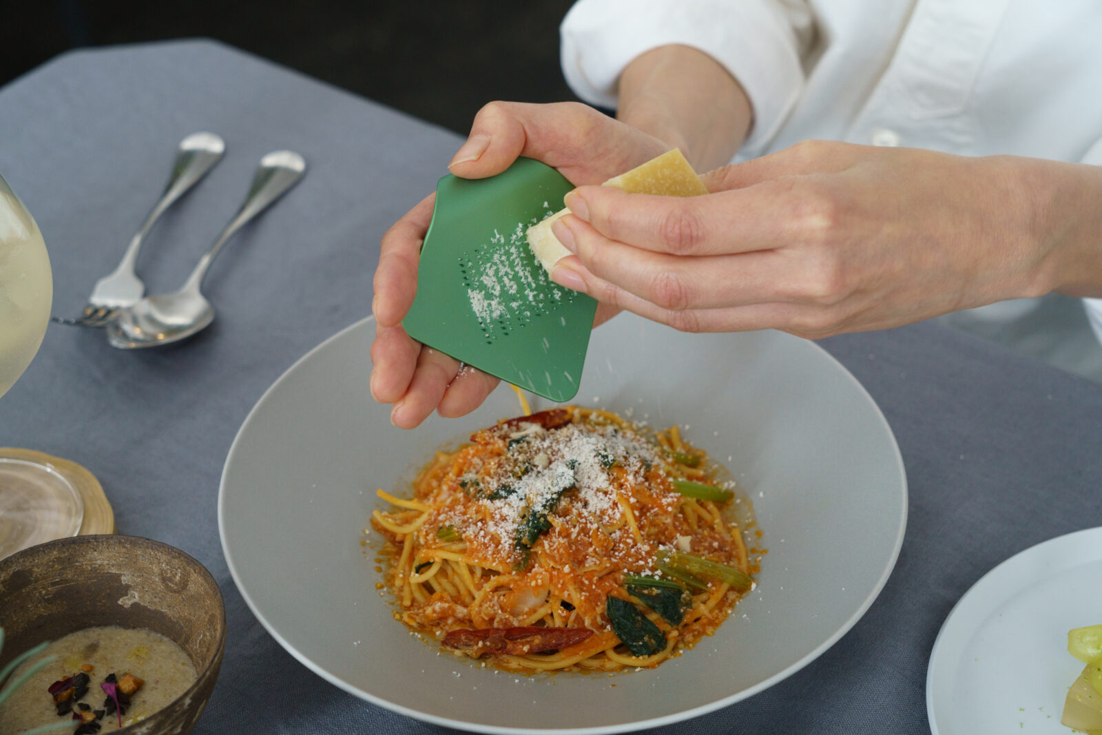
irogami grater|ひとひらのおろし金
Project Info
Credits
- Art Director:
-
- 栗山 薫(kuriyama kaoru design)
- Package Designer:
-
- 栗山 薫(kuriyama kaoru design)
- Illustrator:
-
- 嶋田 雅紀
- Translators:
-
- 船木 亜瑠(Aru International)/ 澤田 友紀(Aquascorpio)
- Product Designer:
-
- Gensuke Kishi
Art Director:
栗山 薫(kuriyama kaoru design)
Package Designer:
栗山 薫(kuriyama kaoru design)
Illustrator:
嶋田 雅紀
Translators:
船木 亜瑠(Aru International)/ 澤田 友紀(Aquascorpio)
Product Designer:
Gensuke Kishi
Categories
Overview
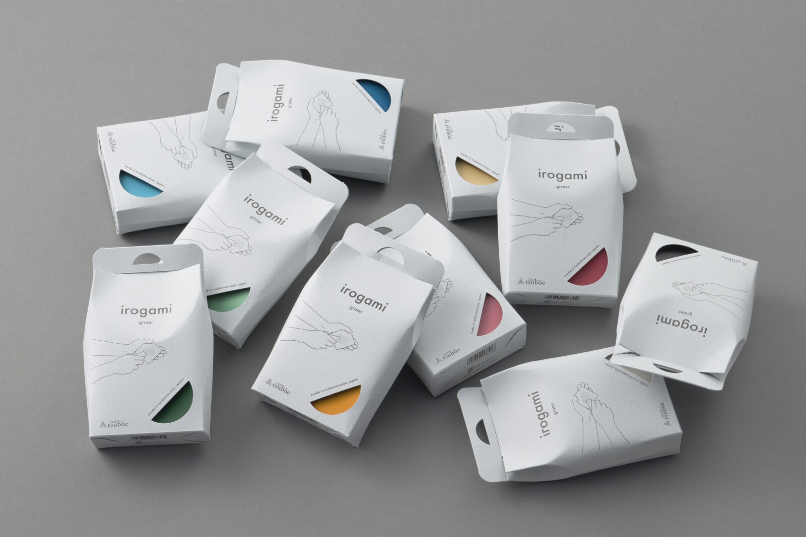
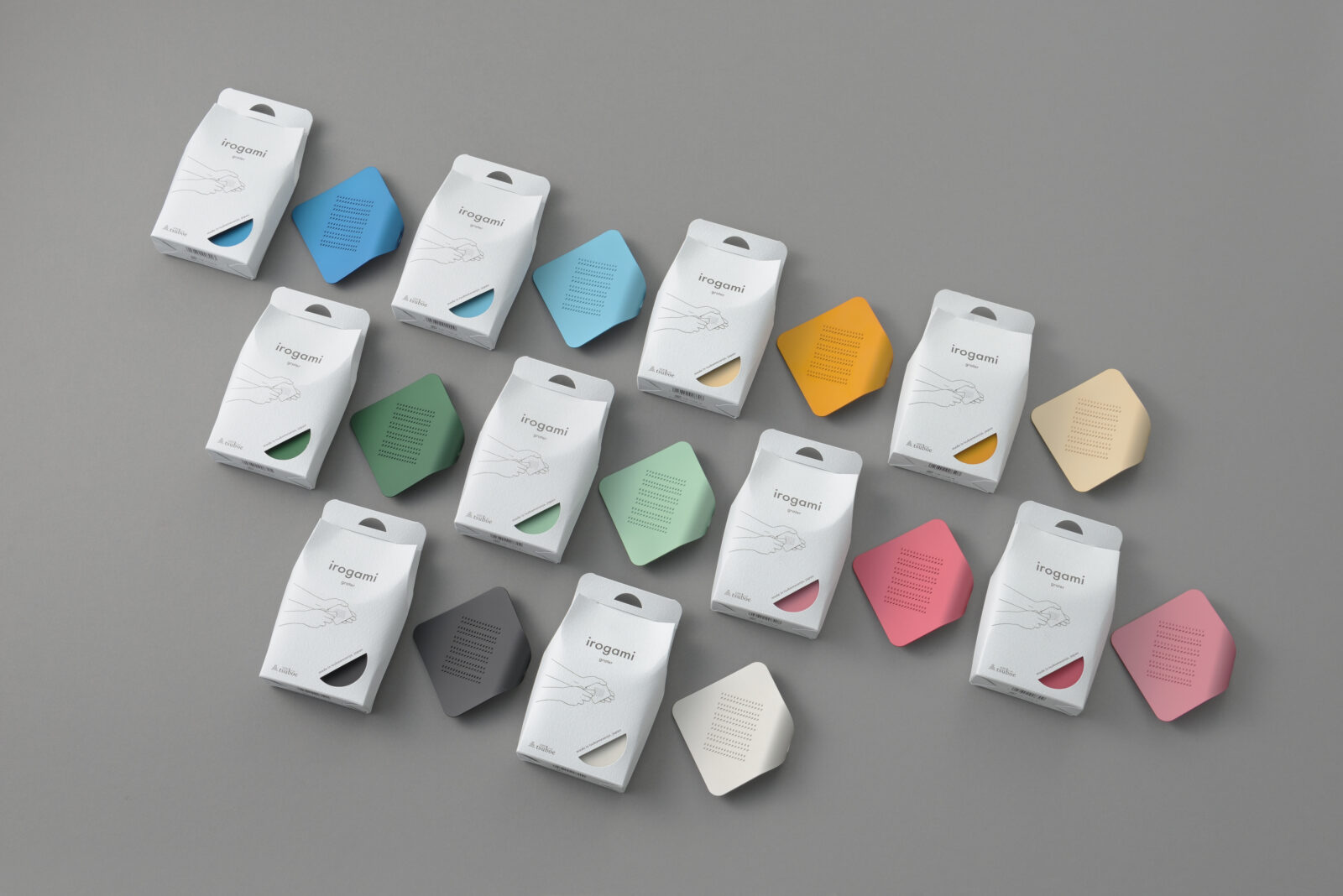
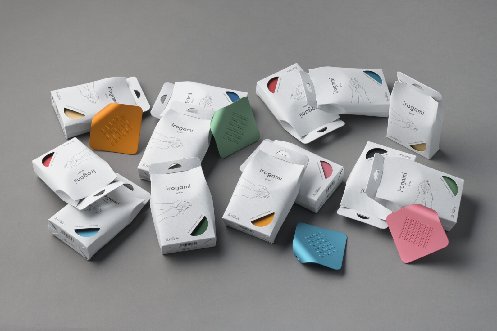
創業明治40年の老舗・株式会社ツボエが展開するブランド「irogami」のおろし金パッケージをリニューアルデザイン。
海外市場を前提とし、店頭ではフック掛け仕様が必須だった。カラーアルマイト工程で生じるジグ用の穴を、フック穴とカラー確認窓として転用し、機能と視認性を両立。
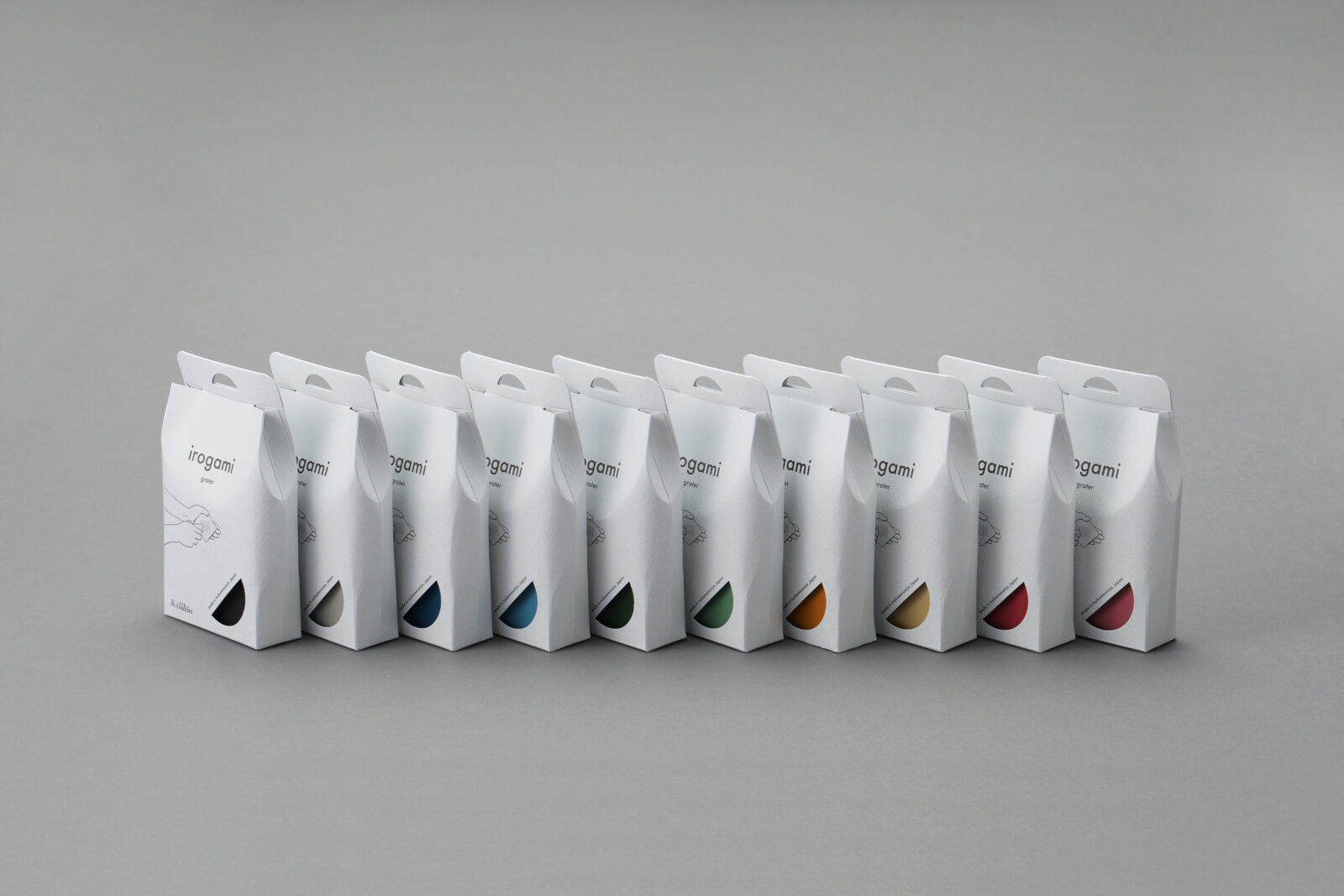
共通パッケージ1種で10色展開に対応し、コストを抑制。しなやかな曲線を踏襲したフォルムが開封時の違和感を排除しました。
前面には、使い方を分かりやすく説明したイラストを配置。今後展開する製品との差別化にも繋げています。
ザラついたアイスグレー紙がメタリックカラーの本体を包むことでトーンを落とし、他ブランドと並んでも「ツボエ製品全体」の世界観に調和する設計。
単一ブランドだけでなく、「企業ブランド全体」という視点でデザインを構築しています。
環境負荷を低減するため、プラスチックは一切使用していない。
ギフト需要を捉えた本リニューアルにより、売上は従来の数倍へと伸長しています。
We redesigned the packaging for irogami, a brand from Tsuboe—an established grater maker founded in 1907.
Targeting overseas markets meant a hanging display was essential. We turned the jig hole needed for color anodizing into both the hang-slot and a window that reveals the grater’s hue, combining function with visibility. One universal pack now handles all ten colors, keeping costs down, while the flowing curves echo the product’s form and eliminate any disconnect at unboxing.
A clear, front-panel illustration explains how to use the grater, setting this release apart from future items in the line. Textured ice-grey paper subdues the vivid metallic body, ensuring the package sits comfortably alongside Tsuboe’s other brands and reinforcing a company-wide visual language—not merely a single product identity.
The box is entirely plastic-free, aligning with sustainability goals. Positioned as a gift-ready item, the redesign has multiplied sales several times over.
All Works
Next Work