THE SASTI|ロゴマーク/サインデザイン
Project Info
- Client:
- 県央ランドマーク株式会社
- Year:
- 2023
Client:
県央ランドマーク株式会社
Year:
2023
Credits
- Art Director:
-
- 栗山 薫(kuriyama kaoru design)
- Designer:
-
- 栗山 薫(kuriyama kaoru design)
Art Director:
栗山 薫(kuriyama kaoru design)
Designer:
栗山 薫(kuriyama kaoru design)
Categories
Overview
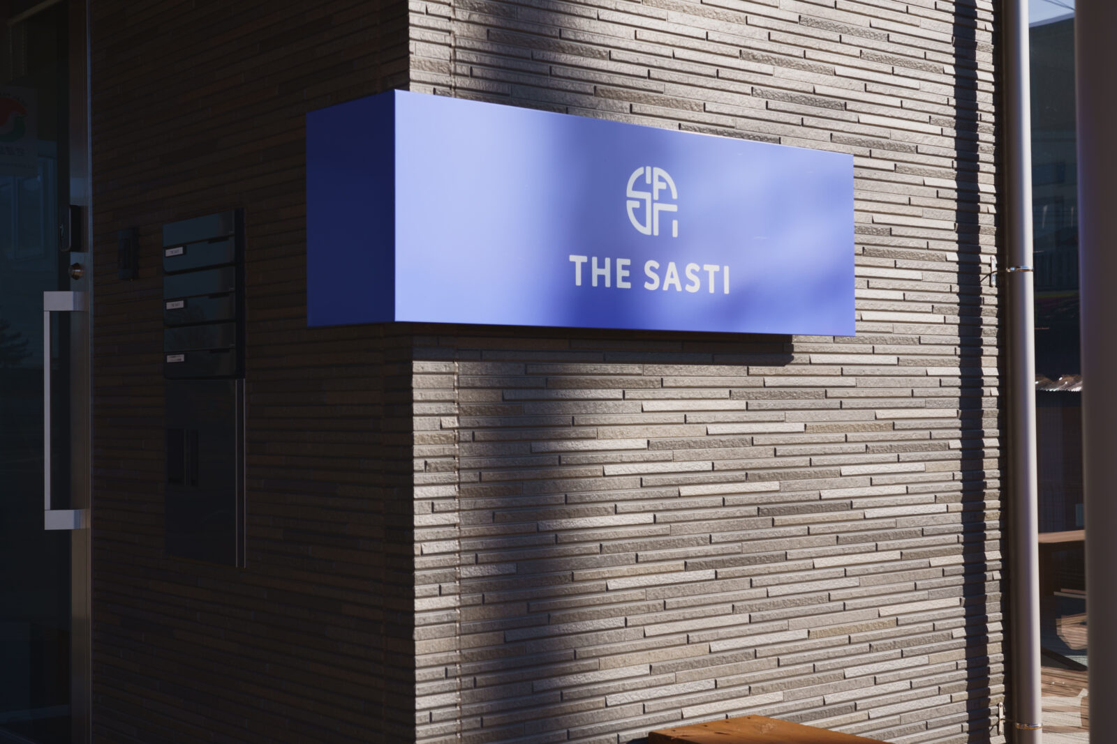
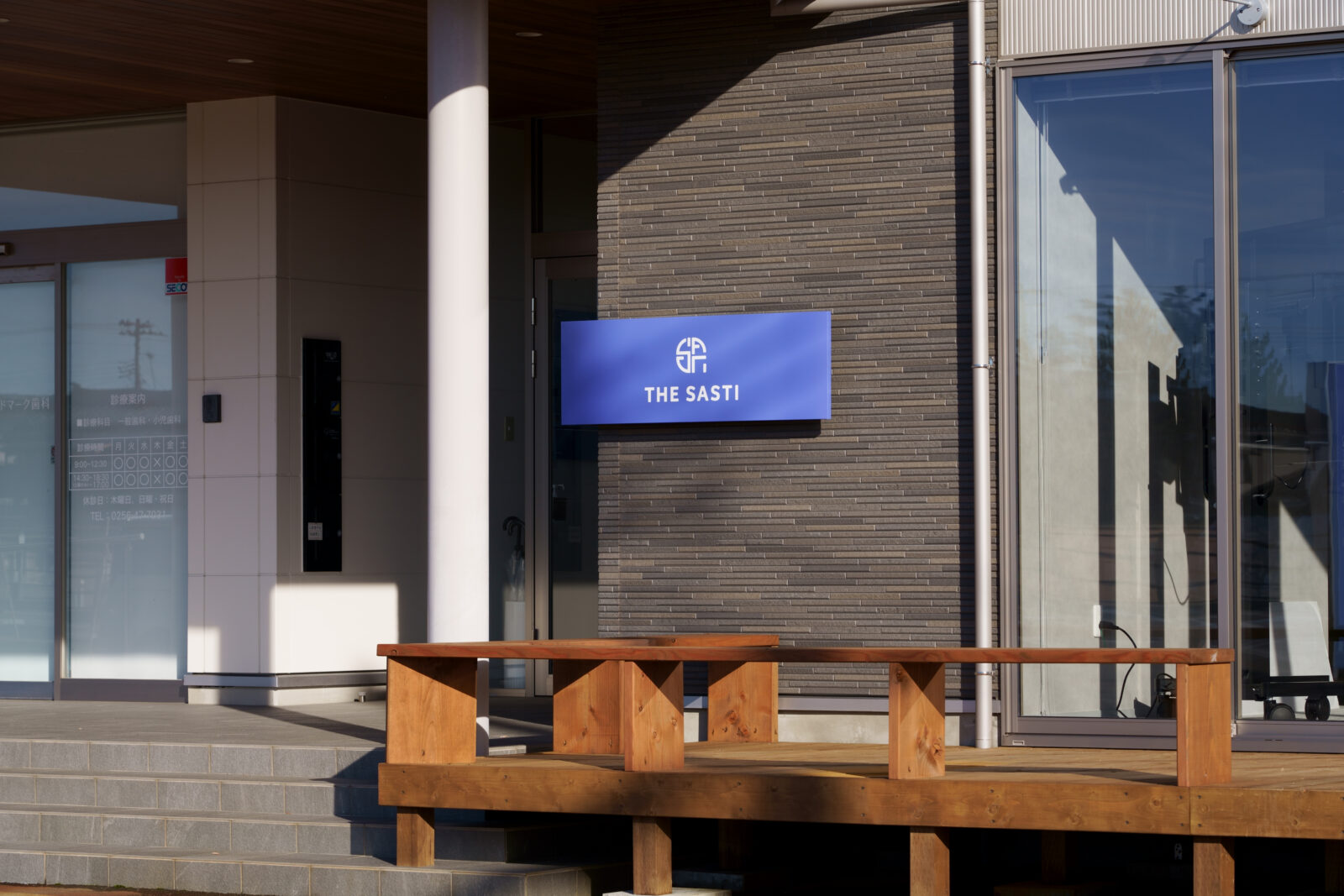
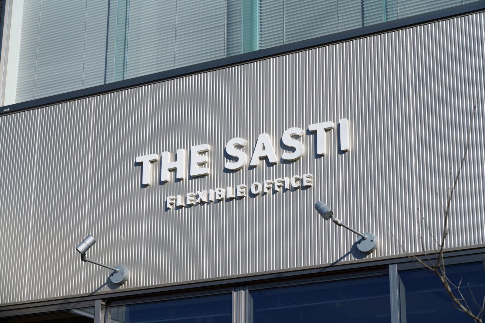
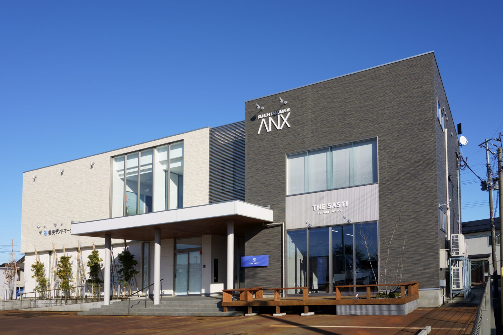
会員制フレキシブルシェアオフィス「THE SASTI」のロゴマーク制作と、実装に用いるサインデザインのデータ提供を担当しました。
掲出環境で確実に機能するサインになるよう、視認性や最小サイズ、色設計などの仕様を整えています。
ロゴコンセプト
「代々受け継がれる大切なもの」を象徴する〈紋〉の構造に着目し、SASTIの文字を「デジタルの筆致」で重ねて図案化。対照的な二要素を一体化させ、企業に根付く継承とDXによる更新が並走する姿を表現しています。
ロゴ内の「I」「T」は建物の内側にいる人を想起させ、拠点施設として人が集い、交わる場であることを示します。
アクセントのオレンジは、穏やかな外観の中に確かな記憶点をつくります。
THE SASTI|Logo Mark & Signage Design
For the members-only flexible shared office THE SASTI, we developed the logo mark and provided implementation-ready signage design assets.
To ensure the signage performs reliably on site, we specified legibility tests, minimum sizes, and color standards appropriate to the display environment.
Logo Concept
Focusing on the structure of a traditional mon—a symbol of “what is handed down across generations”—we overlaid the letters SASTI in a digital stroke, uniting two contrasting elements to express heritage and renewal (DX) advancing side by side.
Within the mark, the letters “I” and “T” evoke people inside the building, signaling a hub where people gather and intersect. The orange accent creates a memorable focal point within the calm exterior.
All Works
Next Work